Have you been avoiding Google Analytics because it’s just too hard to learn? Here’s a gentle introduction to using it to understand your website visitors.
Over a century ago, department store magnate John Wanamaker famously said: “Half the money I spend on advertising is wasted; the trouble is I don’t know which half.”

Unlike Mr. Wanamaker, we’ve got access to tools like Google Analytics to help us out. Google Analytics (GA) is a free web analytics tool that helps you understand your visitors’ interests.
Even if you don’t spend a penny on advertising, you should still try to figure out which of your marketing tactics are working. And GA is a great tool to help you do that.
A Walk Through Google Analytics Reports
If you’re completely new to Google Analytics, here’s my overview. (Need to install GA on your site? Most website builders make it easy to cut and paste the code you’ll need; just conduct an online search to find instructions.)
 Once you have Google Analytics installed (and you’ve let it accumulate data for a few weeks), you can start gleaning info from GA reports.
There are often multiple ways to get at the information you want to find. The best way to learn GA is to change one tab or drop down item at a time and seeing what shows up.
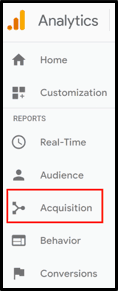
For example, say you want to know which marketing channels are sending you the most traffic. Open Google Analytics, and look for the Acquisition tab in the left navigation menu. (I’ve highlighted Acquisition in the red box.)
Click on Acquisition. The Acquisition menu will open. Click on All Traffic, then Source/Medium.
In Google Analytics, the “Source” refers to the place where traffic that lands up on your site started from. The “Medium” refers to the type of traffic that you’re getting: referrals, organic search, paid search, etc.
A Look at the Source/Medium Report
Below is an edited screenshot of the Source/Medium view. In the pie chart on the right, over 70% (the blue piece of the pie) of the traffic to my website is just grouped under google/organic (meaning that visitors reached goodeggmarketing.com from organic search on Google). And over 20% (the green slice), shows us as Direct/none (meaning that visitors typed my URL directly into their browser or reached my site via a bookmark).
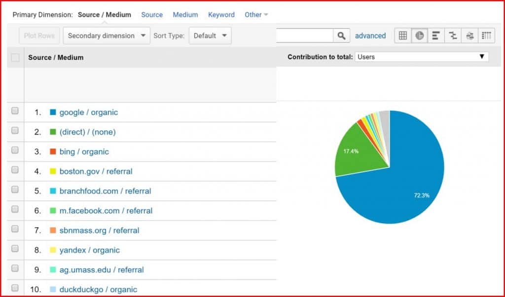
Finding out that over 90% of the traffic to my site comes from these two sources isn’t terribly helpful. To be honest, the default settings in Google Analytics are going to be like this for most websites, due to some limitations in the way Google tracks and shows data. (There are some workarounds, which I’ll cover in a future post.) But once you start playing with the tools Google gives you, you can get more useful info.
For example, you can get a closer look at the 10% of other sites that are referring traffic to you by choosing a different view. Go to the drop down box to the right of Source/Medium, near the top of the report. In the image above, it was set to the default (“Users”.) In the image below, I changed the variable in the drop down box to “Avg. Session Duration,” which tells me the average amount of time that viewers referred by each source spent on my site.
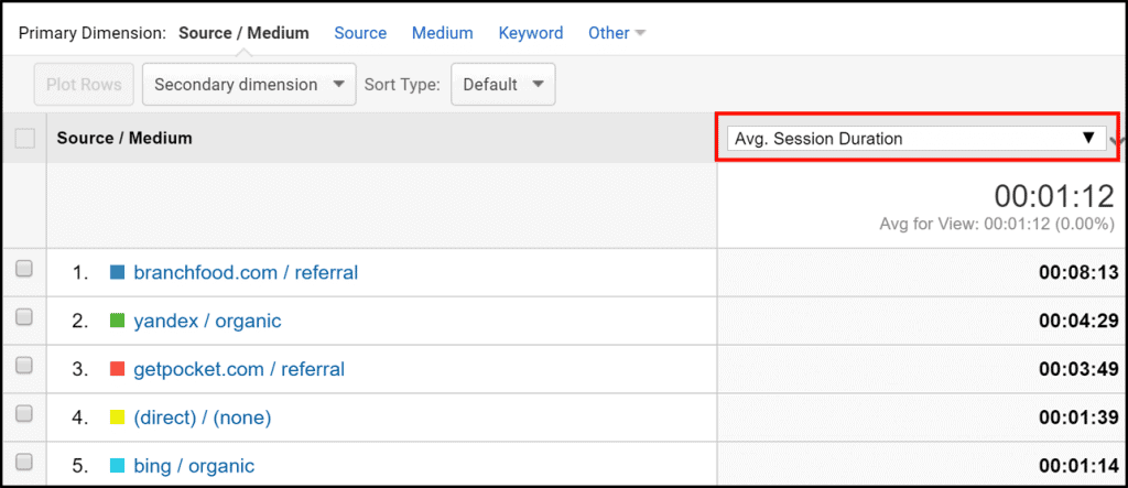
As you can see, visitors from branchfood.com, Yandex.com, and getpocket.com spent much more time on my site than visitors from other sources. These sites accounts for a tiny amount of my traffic, but they’re attracting quality visitors. So that tells me I might want to take a close look at those sites to see if they’re linking to specific content.
Entering the GA “Secondary dimension”
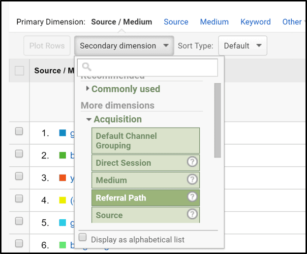 The Google Analytics Secondary dimension is a way for you to see your data through different lenses. You can get to the “secondary dimension” through another drop down box.
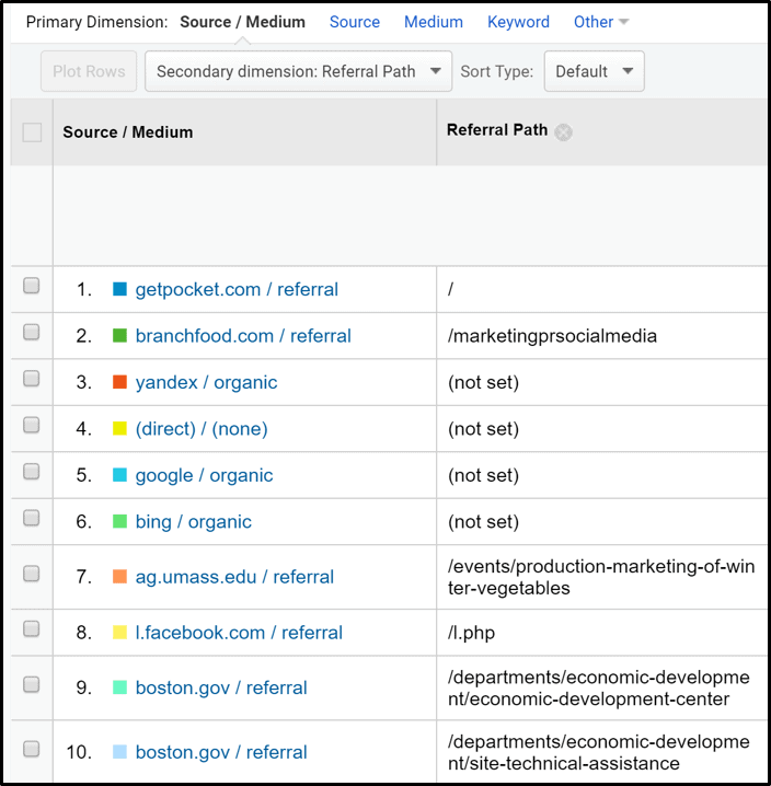
I recommend you play around with different Secondary dimensions to explore what information you can uncover. For now, you want to choose “Referral Path” as your secondary dimension in the drop down list.
The next screenshot shows the results when I combine Source/Medium with “Referral Path.” I can see which specific pages from those referring sites are sending my site the most visitors. This shows me which Good Egg content the other sites think might be useful to their users.
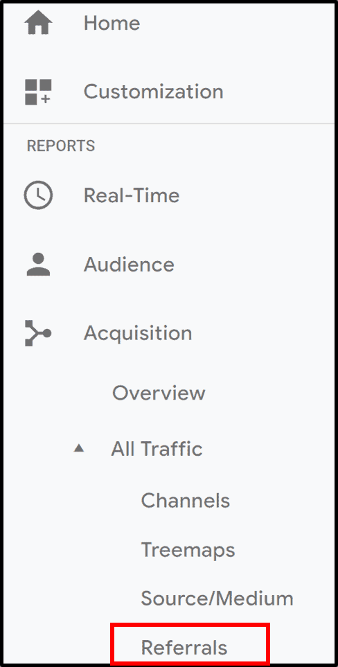 If you want to see which sites are referring traffic to you, go to the Referrals report. To get to the Referrals report, go back to the left navigation and go to Acquisition/All Traffic/Referrals.
The Referrals report can be manipulated in similar ways as the Source/Medium report. You can choose different secondary dimensions from the drop down menu.
If your business has lots of seasonal variations or changes on different days of the week, you can use Month of Year or Day of Week as a Secondary dimension.
Want to compare how visitors from mobile devices get to your site vs. desktops? Use Devise as a Secondary dimension.
Learning From Exit Pages
When you choose “Exit Page” as your Secondary dimension under Referrals, you’ll see the last page that visitors viewed before exiting your site.
You can learn a lot from this data. For example, if visitors from certain sites are all leaving Good Egg Marketing from my home page, that may mean that their visitors aren’t finding what they were looking for on my site. In contrast, visitors who leave my site after reading blog posts, the clients page, or services are more likely to be potential clients or to follow Good Egg on social media.
If you’re doing ecommerce on your site, you’ll definitely want to see which pages visitors are exiting from. This can help you figure out what happened to the people who didn’t end up making a purchase.
Visit the Primary dimension, too
Previously, I showed you how to change the Secondary dimension. You can also change the Primary dimension, which appears at the top of the report (see the red box below).
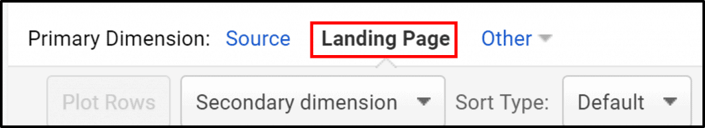
Google Analytics always defaults to the Source as the Primary Dimension here. If you click on Landing page as your Primary Dimension (instead of Source), GA shows you the specific pages on your website that other sites are linking to.
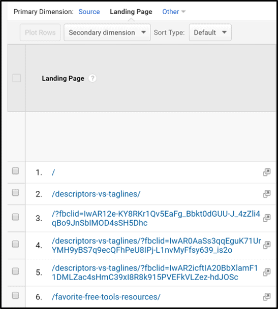
As you can see in the screenshot above, my “descriptors vs. taglines” post is attracting a lot of links.
Note: This screenshot just shows the top results. Like any other report in GA, if you want to see all the results, not just the top 10, you can change the number of results displayed in the table to 50, 100, or 5,000. You can also change the way that GA sorts and displays information. And you can export the results to Excel or csv format.
Conclusion
John Wanamaker would have been glad to get this type of information. I hope this post inspires you to explore a few of the GA reports.
There are so many more things you can track through Google Analytics. For example, you can track the impact of your emails, social media, and other marketing. Now that you’ve seen the basics, I’m eager to show you the good stuff. Stay tuned for my upcoming posts!
In the meantime, you may want to check out Boost Your Local Search Rankings with Google My Business or how to Follow Dr. Google’s Orders.


