
Every small business and organization should have at least a basic website. Even if you mostly talk to your customers on social media, you need a digital location where you can control how you present your business and where you store your digital content. (Don’t have a site yet? Here are some tips about using “Do-It-Yourself” website builders.)
Just having a website, however, isn’t good enough; your site should help you achieve your goals. Whether your primary goal is to attract customers, get newsletter subscribers, or let people know about your sales or daily specials, you need to know if your website is delivering for you.
In addition, you should be able to assess how well your site is working. Are online searches driving traffic to your site? Once visitors get to your site, are they spending time exploring your content? Is your site as easy to use on a cellphone as it is on a desktop?
So how do you know if you have an effective website? Enter Google Analytics.
What is Google Analytics?
Google Analytics (GA) is a  free program that enables you to track and measure whether your website is achieving your goals. It provides you with information that will help you tweak your site to grow your business. If you’re not using GA (or a comparable program), you’re missing out on an incredibly valuable tool.
Unfortunately, many small businesses and nonprofits aren’t taking advantage of GA because they think it’s too complicated. While GA does have sophisticated capabilities that take time to learn, the basic tools are helpful and relatively easy to use. This is the first article in a short series that will help you take advantage of GA.
Let’s start from the very beginning: the Google Analytics Home Page. Google recently rolled out a new landing page that provides helpful data that anyone can use, even if you know nothing about the program.
If you have GA already installed, open it up so you can follow along as I review the features of the new home page. (If you need to install it, here are instructions. You’ll have to install a snippet of code on your website, so if you’re not comfortable with that, you may need help for this piece. I promise–this is the only technical bit in this article.)
A Guide to the New Google Analytics Homepage
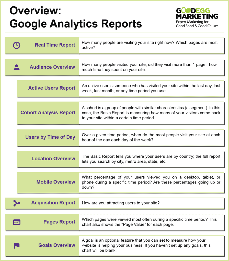
When you open your Google Analytics page, 10 Basic Reports will automatically upload with the latest data. These Basic Reports are designed to help you give you quick insights to help you understand your business. While you can customize them a little, you’ll want to look at the Full Reports that GA offers if you want to dig deeper,
There’s a link on the bottom right of each chart is to go to the full Google Analytics report. If you want to know more about that topic, click on that link. Take a look! You can get a lot more information from looking at the full report, even if you don’t do any customizing. To go back to the landing page, just click Home in the left hand navigation menu.
Customizing the Date Range in Basic Charts
In the bottom left of most charts, there’s a drop down menu that lets you change the time period for the data. The default is 7 days, but you can choose from time ranges on the list—such as the last 90 days or last year—or set your own custom range.

The rest of the data can’t be customized directly in this Home Page view. You will have to visit the Full Report in order to adjust other types of data you want to view.
Key Analytics Concepts
Google has a precise way of calculating each metric, but most of us don’t need to know the details. Here’s a simplified explanation of the terms used in Basic Reports.
The Top 3 Charts for New GA Users
Audience Overview
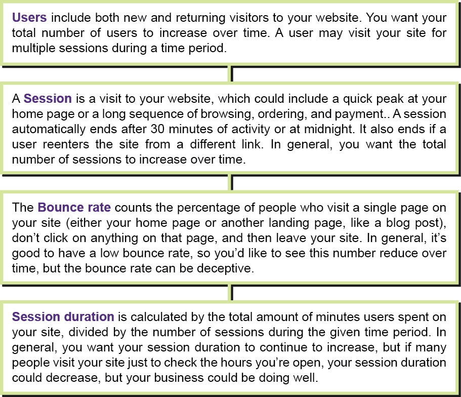
Audience Overview is one of the most valuable of the Basic reports. In addition to providing you with the total number of Users and Sessions during your chosen time period, it tells you the bounce rate and average session duration. An arrow with a percentage below each number tells you whether the number has increase or decreased over the time period.
At the bottom of this chart is a graph that maps the number of website visitors who used the site each day.
In the example to the r ight, a dark blue line shows how the daily website traffic to Good Egg Marketing varied over the past 30 days. The light blue dotted line shows the daily traffic over the previous 30 days. There’s no obvious pattern in either month, but if I were comparing year-over-year visits, for example, I’d be able to tell whether visits typically go down or up during the summer.
This default chart shows the graph for Users. If you click on one of the other data choices at the top of the chart (Users, Sessions, Bounce Rate, or Session Duration), a blue line will appear over that word to indicate that you are in that tab. The chart will shift to show a graphic of the daily statistics for that data during the current and previous time period.
Sessions by Device
 knowing how many of my visitors are viewing the site from a cell phone. Although the majority are still desktop users, that number is going down, so I must make sure my site is easy to navigate on mobile devices. Some business should put more emphasis on mobile views than others. For example, if you’re a casual restaurant in an area with a lot of tourist traffic, mobile views are more important for your business than if you offer a gardening service that someone is more likely to research on their desktop than on their phone.
Customer Acquisition Report
This report packs a lot of information. Like the Audience Overview Chart, it has three tabs, so be sure to visit all of them.

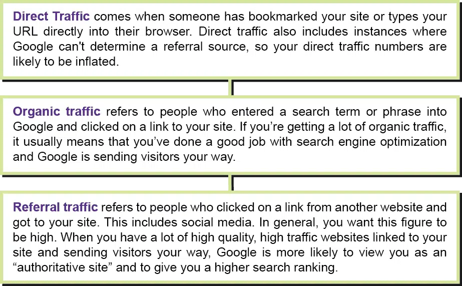
1. Traffic Channel: A traffic channel refers to the source or means by which you’re attracting people to your website. GA has four default channels in this Basic Report: Direct, Organic, Referral and Other.
The Chart above is set for a 7 day period. The dark blue color gives me a visual idea of how much traffic came from organic search each day. As you can see, it fluctuated quite a bit. (I may want to drill down later to see if I can figure out why.) The Direct Traffic (slightly lighter blue) also varied, but not quite as much.
2. Source/Medium: The first term (Source) in Source/Medium refers to the channel that the traffic is coming from; the second term (Medium) refers to the type of category that the channel belongs to. For example, your source/medium could be google/organic (unpaid) or google/paid. If you’re running paid ads, you’d want to know how much traffic is coming from the paid ads versus the free listings.
The reason why this chart is useful is that instead of just telling you how much of your traffic (the Source) is organic, it can show you how much of that organic traffic is coming from Google vs. Bing (the Medium). If you notice that your traffic from Bing is increasing, for example, you may start paying more attention to Bing.
3. Referrals: This tab will show you which sites generated the most referrals during the designated time period. If you notice that a particular website seems to have provided a lot of referrals, find out whether it’s a positive referral or potentially a spam site. If you go to that URL and like how they’re listing you, you may want to contact them and build a relationship.
You Can Do It!
Now, even if you do nothing more than look at your Google Analytics home page once a month, you’ll be able to get some interesting information. For those of you just starting out with Google Analytics, this will hopefully whet your appetite for doing more.


