I’ve been looking at hundreds of food and farm websites as part of a project I’m doing for a client, and, frankly, some of them are giving me a headache! Too much text, too many garish colors, and way too many flashing images.
With all the free and inexpensive tools out there, every farm, small business and nonprofit can have a decent-looking website. But an effective website must not only look good–it should also answer the four questions below.
Four Questions Your Site Must Answer
- Who are you?
- What do you do?
- What’s in it for me?
- What do you want me to do?
1. Who are you?
When I visit your website, I want to “get” who you are in a few seconds. If your name and logo don’t tell the whole story, you may need a brief descriptor or a tagline to make it clear.
Your home page is the front door to your business or organization. When I visit your website, I want to know what kind of joint I’m walking into. Can I practically smell the garlic? Use words sparingly; let photos, colors, and white space convey your message.

Take a look at this screenshot from the Bonnie’s Jams website. Her tagline, “Remembering the Taste of Fruit,” makes my mouth water. The clean lines, gift-wrapped package, and ghosted image of fruit at the top of the page set the mood for a nostalgic, authentic experience. I get it right away.
2. What do you do?
Make it easy for me to grasp what products or services you offer, the issues you work on, or your quirky point-of-view. If your name, descriptor, or tagline doesn’t convey enough information, you may want to use a sentence or short paragraph to provide a top level overview. The tabs on your page menu may be sufficient to show what you offer.
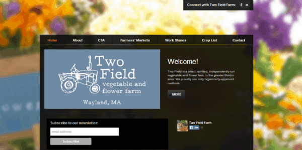 This simple home page, built on Weebly, which lets you build a free website, clearly conveys who Two Field Farm is and what they do. It’s also full of attitude. The black backdrop is rather stark, but is softened by the beautiful flowers in the background.
Their home page also features a clear action for you to take (subscribe to our newsletter) and a photo gallery with some really nice photography.
3. What’s in it for me?
Your website needs to be more than a brochure describing who you are and what you do. What type of visitors are you trying to attract and what do they want and need? What can you offer that might appeal to them? News or analysis about your cause? A great family recipe or how-to article? A fun story, photo or video (preferably with cute animals in it) that helps them experience daily life on your farm? Show us what’s special or unique about what you do, or the stuff you’re really proud of.
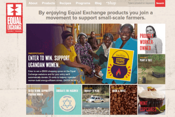 Equal Exchange‘s home page uses a short sentence to explain what’s in it for me: “By enjoying Equal Exchange products you join a movement to support small-scale farmers.” In addition to words, however, the home page features an attractive collage that also draws me in.
Each box succinctly depicts an aspect of their products, programs, or principles, with a link for more info. The large box in the top left corner featuring their sweepstakes provides a focal point; When I click on any of the smaller boxes, it moves into the larger focal point area and I can click from there for more info. The site is full of information and interactive features that make you want to learn more.
4. What do you want me to do?
An effective website either directly or indirectly asks people to do something: buy your product, take action on an issue, or sign up for your email list. Your “asks” (a “Call to Action,” in marketing terms) should be clearly visible, but not dominate the page. Either focus on one action you want visitors to take (such as visiting your online store) or group your asks together, so you don’t confuse your visitors.
Many web sites use sliders (rotating photos and/or text), often with clickable links) to convey a series of concepts. Sliders can be a great way to succinctly lead visitors towards taking an action, but make sure the image sizes don’t overwhelm your homepage. Take a moment to smile and say hello before you ask someone to buy.
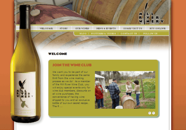
This simple, elegant home page for Mill River Winery uses a slider that’s nicely sized for the page. The subtle asks are embedded in the slider images and text, rotating between “Join the Wine Club,” “Rick and Steve Tasting 2013 Riesling,” “Our Winter Hours,” and “We Ship Wine to MA, NH, FL, MN, AK, and D.C.” The image of the wine barrels at the top of the page, the beautiful bottle of wine, and the tasteful orange background make you want to reach for a glass of chilled white wine.
I hope these pointers help you get started on creating or relaunching your website.
P.S. Want more advice? Contact me and I’ll send you a free worksheet to help you plan your website.


